Student Work (Red River River College)
project
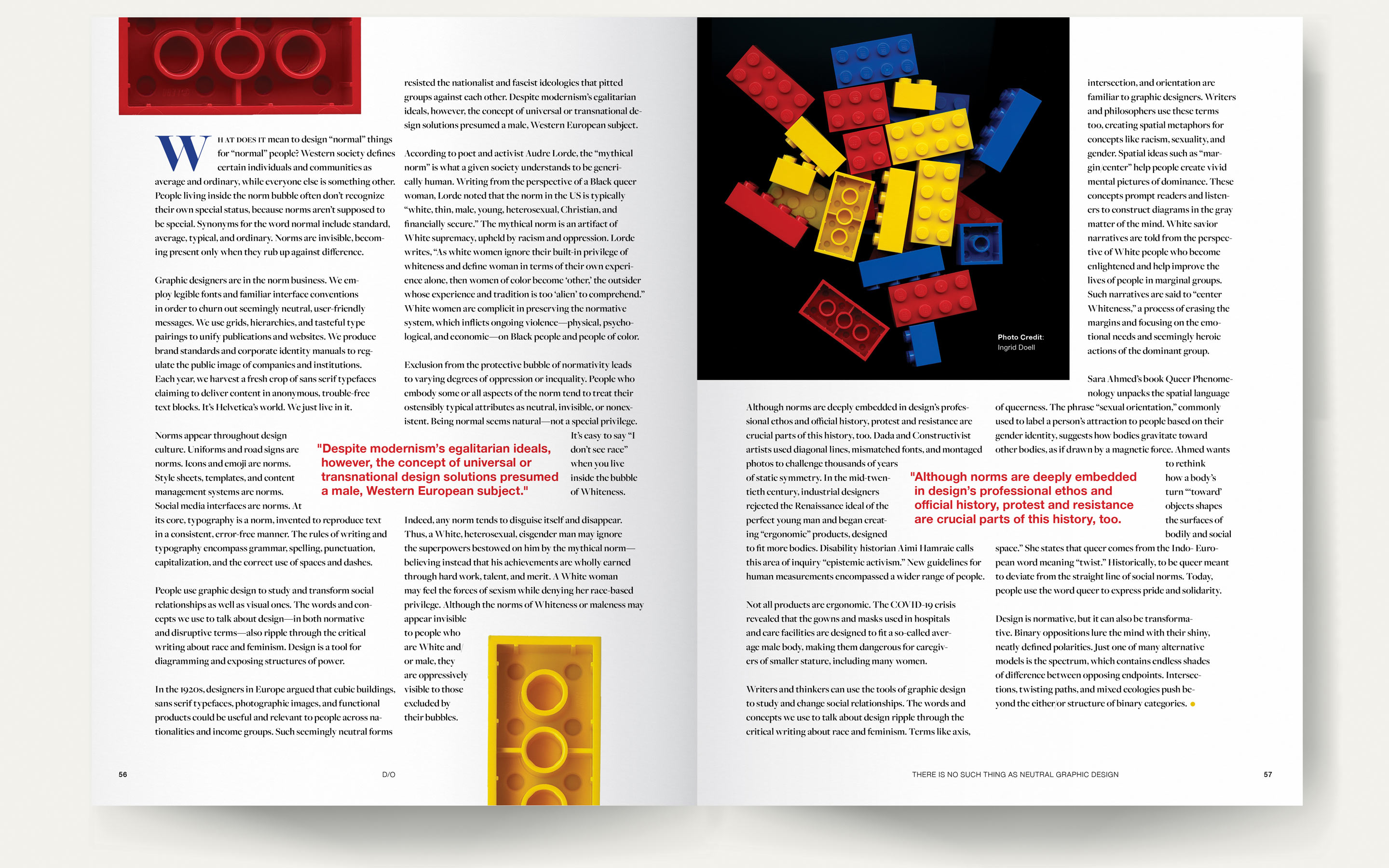
Design a four-page feature article for a fictitious magazine (D/O) that explores contemporary ideas and methods in design and creativity. The opening spread will use a unique, photo-based solution that acts as a visual metaphor for the content of the article.
design rationale
This spread is inspired by the last paragraph of the article, which explores binary oppositions and spectrums. It contrasts binary ways of thinking and designing (represented by the black and white figure) with a spectrum (represented by the colourful one). The black and white, binary figure is given the primary focus and position of power, but the spectrum already exists in the reflection. This spectrum of colour spreads throughout the design highlighting the depth and meaning found by looking beyond black and white thinking.
The article’s text appeals to D/O readership through its concentration on equity and by encouraging designers to be introspective and work for change in the field. The use of Lego in the photography and design will appeal to creative professionals through its universality and its playful nature. Additionally, the use of a children’s toy in a professional magazine will surprise and delight readers. The limited colour palette of red, blue, yellow, and black unifies the design while also drawing on basic colour theory and alluding to Bauhaus designs. Helvetica Neue was chosen because it is a recognizably ubiquitous neutral font. Yet it is also classic, clean, and modern. Freight Pro is an easily readable serif font, with a variety of weights, which makes it flexible for design and visually interesting.


